
Project Overview
Following Time Products’ acquisition of the iconic British watch brand Accurist, I was tasked with assembling and leading a creative team—including graphic designers, photographers, retouchers, and copywriters—to modernise the brand’s identity and refresh its visual direction.
Following Time Products’ acquisition of the iconic British watch brand Accurist, I was tasked with assembling and leading a creative team—including graphic designers, photographers, retouchers, and copywriters—to modernise the brand’s identity and refresh its visual direction.
Brand Refresh
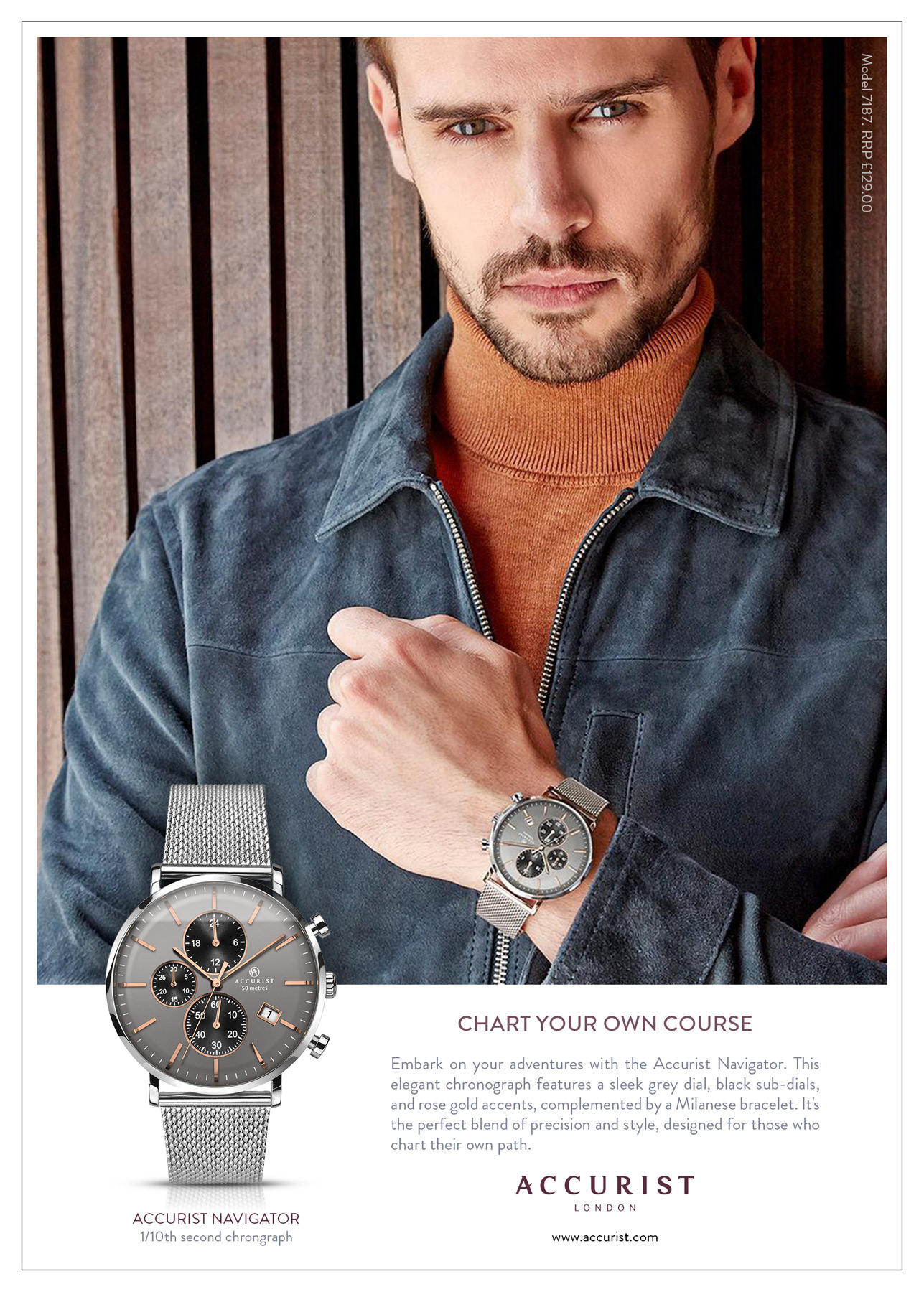
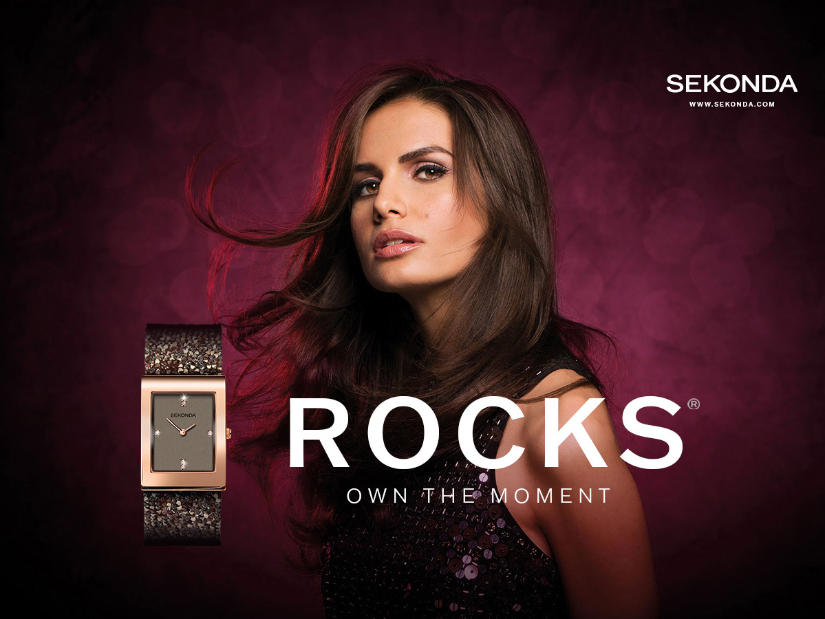
I personally oversaw the development of a new logo, visual narrative, and a distinctive colour palette that anchored the brand’s updated look. The refreshed identity prominently features deep burgundy and luxurious bronze tones, carefully selected to convey a blend of tradition and modern luxury.
I personally oversaw the development of a new logo, visual narrative, and a distinctive colour palette that anchored the brand’s updated look. The refreshed identity prominently features deep burgundy and luxurious bronze tones, carefully selected to convey a blend of tradition and modern luxury.
Design Strategy
The velvety burgundy evokes timeless elegance, while the shimmering bronze adds a contemporary sense of opulence. Together, these colours create a dynamic contrast aimed at appealing to a younger, style-conscious audience without losing the brand’s classic heritage.
The velvety burgundy evokes timeless elegance, while the shimmering bronze adds a contemporary sense of opulence. Together, these colours create a dynamic contrast aimed at appealing to a younger, style-conscious audience without losing the brand’s classic heritage.
Outcome
This revitalised identity successfully balances classic appeal with modern relevance, positioning Accurist as a timeless yet contemporary brand for today’s discerning consumers.
This revitalised identity successfully balances classic appeal with modern relevance, positioning Accurist as a timeless yet contemporary brand for today’s discerning consumers.
Highlights:
• Assembled and led a multidisciplinary creative team to redefine Accurist’s brand identity
• Developed a new logo and compelling visual narrative reflecting modern luxury
• Crafted a sophisticated colour palette.
• Repositioned the brand to attract a younger, style-conscious audience.
• Assembled and led a multidisciplinary creative team to redefine Accurist’s brand identity
• Developed a new logo and compelling visual narrative reflecting modern luxury
• Crafted a sophisticated colour palette.
• Repositioned the brand to attract a younger, style-conscious audience.